
9.5 Supplemental Readings
Supplemental Reading Topics
Art Nouveau
Art Nouveau artists and designers created a completely new style of decoration, rejecting the widespread nineteenth-century practice of copying historical, and especially Classical and Medieval, forms. While each designer invented their own decorative motifs, organic, often plant-based, forms and the whiplash line became hallmarks of Art Nouveau design, appearing in multiple media and contexts. Victor Horta’s Tassel House in Brussels is one of the earliest examples of the Art Nouveau style. Horta designed the building’s architecture and every detail of the interior decoration and furnishings, making the house into a Gesamtkunstwerk, or total art work in multiple media. The repeated use of organically curved, undulating lines — often called whiplash lines — unifies the design, repeating in the floor tiles, wall painting, ironwork, and even in the structure of the spiraling staircase and surging entryways.
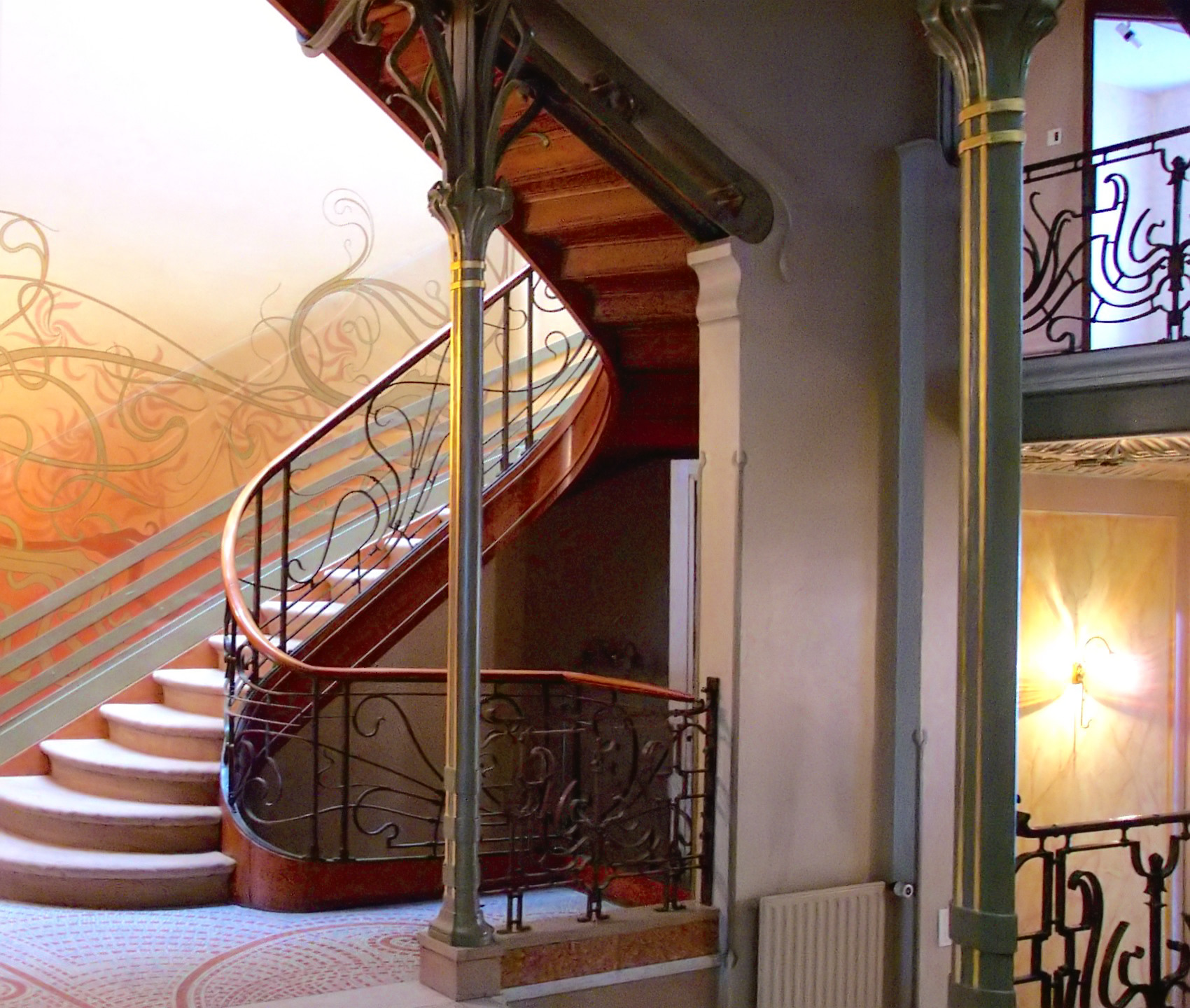
Art Nouveau architects and designers also embraced modern building materials, notably cast iron. Cast iron is both stronger and more flexible than traditional wood or stone and allows for much thinner supports, like the slender columns in Horta’s own house. Iron support structures also made it possible to create curved facades with large windows, which became prominent elements in many Art Nouveau buildings, including Horta’s Maison du Peuple. Art Nouveau is only one of many names given to this international fin-de-siècle style, which had many regional variations. The term (French for “New Art”) derives from La Maison de L’Art Nouveau, the Paris art gallery run by Siegfried Bing, who was a major promoter of the new style, as well as of Japonisme and the Nabis. In addition to marketing individual objects, Bing commissioned artists and designers to create model rooms in his gallery to display Art Nouveau ensembles that included furniture, wallpaper, carpets, and paintings.
French Art Nouveau was linked to government-supported efforts to expand the decorative arts and associated craft industries. Private residences and luxury objects were the focus for many Art Nouveau designers, including Emile Gallé, who made both decorative glass and furniture. Despite the close association of Art Nouveau with luxury items, the style is also apparent in urban design, public buildings, and art for the masses. Horta’s Maison du Peuple was the center for the socialist Belgian Workers’ Party, and among the most famous examples of Art Nouveau style are Hector Guimard’s entrances to the Paris Metro, the city’s new public transportation system.
Art Nouveau designs were also widely visible in the advertising posters that decorated Paris. Henri de Toulouse-Lautrec, Alphonse Mucha, and Jules Chéret depicted famous fin-de-siècle performers such as Jane Avril, Sarah Bernhardt, and Loïe Fuller. Their posters stylized the female body and used sinuous whiplash lines, decorative plant forms, and flattened abstract shapes to create vivid decorative images.
Art Nouveau was fashionable for only a brief period around the year 1900, but the movement was part of a long-term modern trend that rejected historicism and Academicism and embraced new materials and original forms. In the modern period artists and designers increasingly recognized that the health and well-being of society and all its members were supported and enhanced by well-designed objects, buildings, and spaces. The unified designs of Art Nouveau presaged the innovations of the Bauhaus as well as architects such as Frank Lloyd Wright and Le Corbusier.
Gustav Klimt, The Kiss
Video URL: https://youtu.be/BRUOACBkFRg?si=stDOymUGO3KX9VFd
Edvard Munch, The Scream
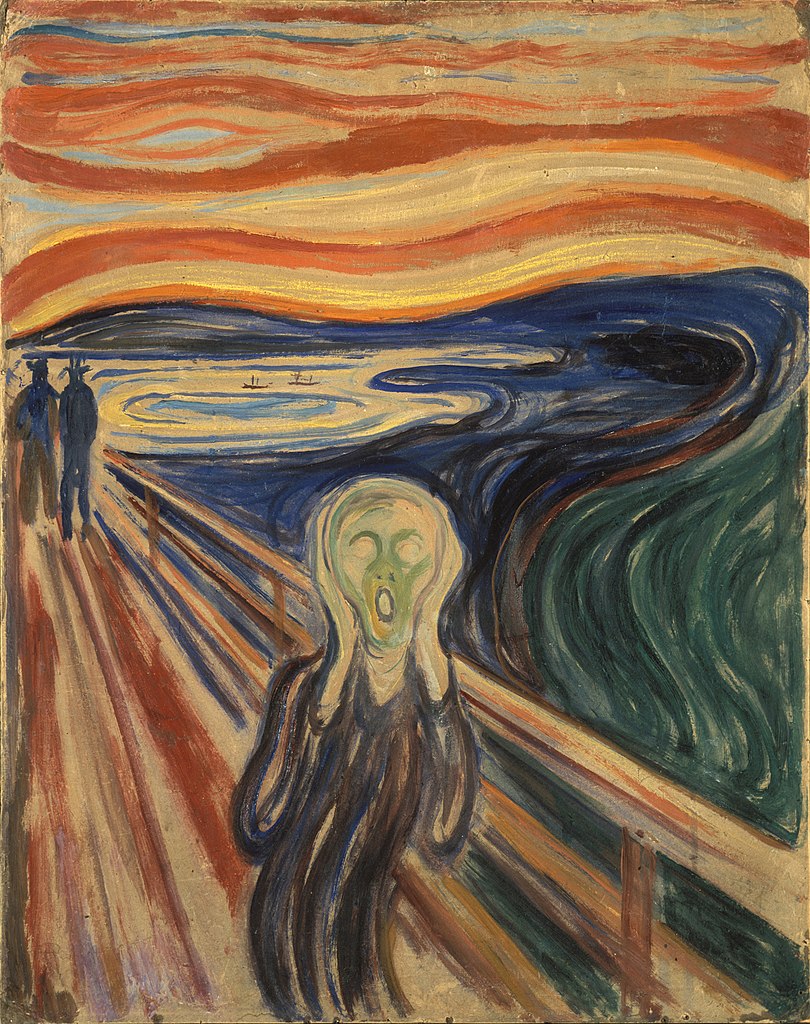
Second only to Leonardo da Vinci’s Mona Lisa, Edvard Munch’s The Scream may be the most iconic human figure in the history of Western art. Its androgynous, skull-shaped head, elongated hands, wide eyes, flaring nostrils and ovoid mouth have been engrained in our collective cultural consciousness; the swirling blue landscape and especially the fiery orange and yellow sky have engendered numerous theories regarding the scene that is depicted. Like the Mona Lisa, The Scream has been the target of dramatic thefts and recoveries, and in 2012 a version created with pastel on cardboard sold to a private collector for nearly $120,000,000 making it the second highest price achieved at that time by a painting at auction.
Conceived as part of Munch’s semi-autobiographical cycle “The Frieze of Life,” The Scream’s composition exists in four forms: the first painting, done in oil, tempera, and pastel on cardboard (1893, National Gallery of Art, Oslo), two pastel examples (1893, Munch Museum, Oslo and 1895, private collection), and a final tempera painting (1910, National Gallery of Art, Oslo). Munch also created a lithographic version in 1895. The various renditions show the artist’s creativity and his interest in experimenting with the possibilities to be obtained across an array of media, while the work’s subject matter fits with Munch’s interest at the time in themes of relationships, life, death, and dread.
For all its notoriety, The Scream is in fact a surprisingly simple work, in which the artist utilized a minimum of forms to achieve maximum expressiveness. It consists of three main areas: the bridge, which extends at a steep angle from the middle distance at the left to fill the foreground; a landscape of shoreline, lake or fjord, and hills; and the sky, which is activated with curving lines in tones of orange, yellow, red, and blue-green. Foreground and background blend into one another, and the lyrical lines of the hills ripple through the sky as well. The human figures are starkly separated from this landscape by the bridge. Its strict linearity provides a contrast with the shapes of the landscape and the sky. The two faceless upright figures in the background belong to the geometric precision of the bridge, while the lines of the foreground figure’s body, hands, and head take up the same curving shapes that dominate the background landscape.
The figure on the bridge—who may even be symbolic of Munch himself—feels the cry of nature, a sound that is sensed internally rather than heard with the ears. Yet, how can this sensation be conveyed in visual terms?
Munch’s approach to the experience of synesthesia, or the union of senses (for example the belief that one might taste a color or smell a musical note), results in the visual depiction of sound and emotion. As such, The Scream represents a key work for the Symbolist movement as well as an important inspiration for the Expressionist movement of the early twentieth century. Symbolist artists of diverse international backgrounds confronted questions regarding the nature of subjectivity and its visual depiction. As Munch himself put it succinctly in a notebook entry on subjective vision written in 1889, “It is not the chair which is to be painted but what the human being has felt in relation to it.”
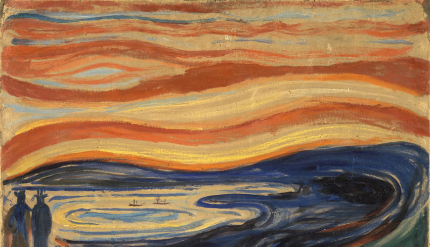
Since The Scream’s first appearance, many critics and scholars have attempted to determine the exact scene depicted, as well as inspirations for the screaming figure. For example, it has been asserted that the unnaturally harsh colors of the sky may have been due to volcanic dust from the eruption of Krakatoa in Indonesia, which produced spectacular sunsets around the world for months afterwards. This event occurred in 1883, ten years before Munch painted the first version of The Scream. However, as Munch’s journal entry—written in the south of France but recalling an evening by Norway’s fjords also demonstrates—The Scream is a work of remembered sensation rather than perceived reality. Art historians have also noted the figure’s resemblance to a Peruvian mummy that had been exhibited at the World’s Fair in Paris in 1889 (an artifact that also inspired the Symbolist painter Paul Gauguin) or to another mummy displayed in Florence. While such events and objects are visually plausible, the work’s effect on the viewer does not depend on one’s familiarity with a precise list of historical, naturalistic, or formal sources. Rather, Munch sought to express internal emotions through external forms and thereby provide a visual image for a universal human experience.
Copyright: Dr. Noelle Paulson, “Edvard Munch, The Scream,” in Smarthistory, August 9, 2015, accessed June 17, 2024, https://smarthistory.org/munch-the-scream/.
Fauvism
Introduction to Fauvism
Fauvism developed in France to become one of the first new artistic styles of the 20th century. In contrast to the dark, vaguely disturbing nature of much fin-de-siècle, or turn-of-the-century, Symbolist art, the Fauves produced bright cheery landscapes and figure paintings, characterized by pure vivid color and bold distinctive brushwork. The best known Fauve artists include Henri Matisse, André Derain, and Maurice Vlaminck who pioneered its distinctive style. Their early works reveal the influence of Post-Impressionist artists, especially Neo-Impressionists like Paul Signac, whose interest in color’s optical effects had led to a divisionist method of juxtaposing pure hues on canvas. The Fauves, however, lacked such scientific intent. They emphasized the expressive potential of color, employing it arbitrarily, not based on an object’s natural appearance.
Like many modern artists, the Fauves also found inspiration in objects from Africa and other non-Western cultures. Seen through a colonialist lens, the formal distinctions of African art reflected current notions of Primitivism—the belief that, lacking the corrupting influence of European civilization, non-western peoples were more in tune with the primal elements of nature. The Fauves’ interest in Primitivism reinforced their reputation as “wild beasts” who sought new possibilities for art through their exploration of direct expression, impactful visual forms and instinctual appeal.
Copyright: : Dr. Virginia B. Spivey, “Fauvism, an introduction,” in Smarthistory, August 9, 2015, accessed June 17, 2024, https://smarthistory.org/a-beginners-guide-to-fauvism/.
Henri Matisse, Dance I
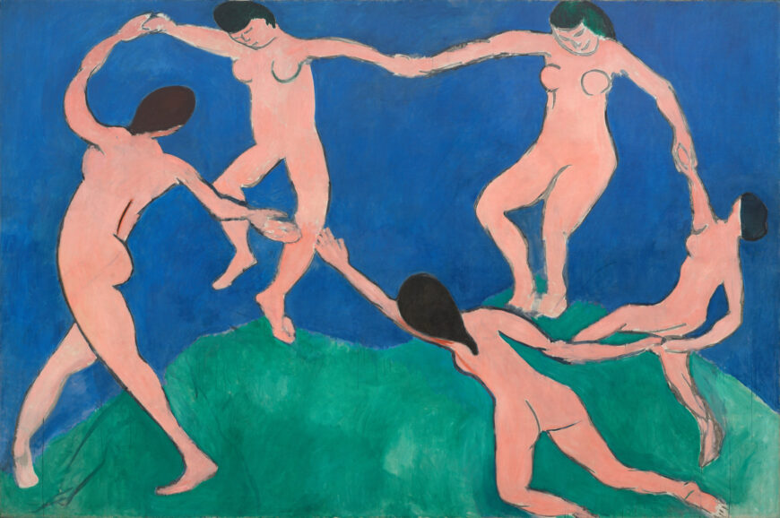
In 1909 Henri Matisse received an important commission. An extremely wealthy Russian industrialist named Sergei Shchukin asked Matisse for three large scale canvases to decorate the spiral staircase of his mansion, the Trubetskoy Palace, in Moscow. The large and well loved painting, Dance I at MoMA, is somewhat disingenuously titled. Although it is full scale and in oil, Matisse did not consider it more than a preparatory sketch. Yet a comparison between the initial and final versions is instructive. Matisse borrowed the motif from the back of the 1905–06 painting Bonheur de Vivre, although he has removed one dancer.
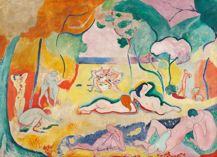
In Dance I, the figures express the light pleasure and joy that was so much a part of the earlier Fauve painting. The figures are drawn loosely, with almost no interior definition. They have been likened to bean bag dolls because of their formless and unrestricted movements. The bodies certainly don’t seem to be restrained by way. But don’t let this childlike spontaneity fool you. Matisse works very hard to make his paintings seem effortless. Imagine for a moment, that instead of this childlike style, Matisse had decided to render this figures with the frozen density of Jacques Louis David. Would the sense of pure joy, the sense of play have been as well expressed? Matisse has done something that is actually very difficult. He has unlearned the lessons of representation so that he can create an image where form matches content.
The dancers inhabit a brilliant blue and green field. But what exactly does the green represent? Many people would quickly reply, “a grassy hilltop.” Okay, but what then is the blue intended to represent? If I were lecturing at MoMA, as I often do, many listeners would offer that “the blue is the sky that rises above the hill.” But others in my group might begin to look frustrated. One might then say, “that’s not what I see, the blue is really water moving back into the distance.”
What Matisse has done here, even in seemingly simple rendering, is use spatial ambiguity to explore one of the key issues in modern painting, the conflict between the illusion of depth and an acknowledgment of the flatness of the canvas. One final point here, did you notice the break in the circle? The hands of the two front dancers are parted. Matisse has been careful to allow this break only where it overlaps the knee so as not to interrupt the continuity of the color. Why do this? The part is often interpreted in two ways, as a source of tension that requires resolution or, as an invitation to us the viewer to join in, after all, the break is at the point closest to our position.
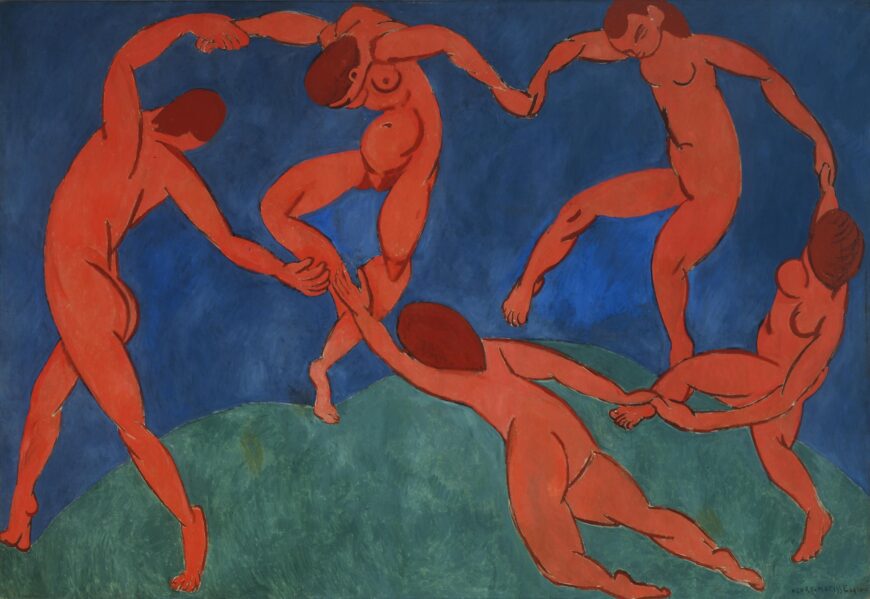
The final version of Dance has a very different emotional character. It has been described as forbidding, menacing, ritualistic, even demonic. Drum beats almost seem to be heard as the simple pleasure of the original is overwhelmed. What causes these dramatic changes in mood? Beyond the color shift, which is pretty obvious, the figures of the 1910 canvas are drawn with more interior line, line which often suggests tension and physical power. See for instance, the back left figure. Another more subtle change occurs where the two back figures touch the ground. In the 1909 canvas, the green reaches up to the feet of the two back most dancers, in the 1910 canvas, something else happens, the green seems to compress under the dancer’s weight. This subtle change creates either a sense of lightness or a sense of weight and contributes to the way we perceive each painting. While Matisse’s artistic style may exhibit a child-like quality, he was fully aware of his deliberate choices and intentions.
Copyright: Dr. Beth Harris and Dr. Steven Zucker, “Henri Matisse, Dance I,” in Smarthistory, August 9, 2015, accessed June 17, 2024, https://smarthistory.org/matisse-dance-i/.
Expressionism
Expressionism, an Introduction
Though many artists of the early twentieth century can accurately be called Expressionists, two groups that developed in Germany, Die Brücke (The Bridge) and Der Blaue Reiter (The Blue Rider), are among the best known and help to define the style. Influenced in part by the spiritual interests of Romanticism and Symbolism, these artists moved further from the idealized figures and smooth surface of 19th century academic painting that can be seen in paintings by Lawrence Alma-Tadema, for example. Instead of depicting the visible exterior of their subjects, they sought to express profound emotional experience through their art. German Expressionists, like other European artists of the time, found inspiration in so-called “primitive” sources that included African art, as well as European medieval and folk art and others untrained in Western artistic traditions. For the Expressionists, these sources offered alternatives to established conventions of European art and suggested a more authentic creative impulse.
In 1905, four young artists working in Dresden and Berlin, joined together, calling themselves Die Brücke (The Bridge). Led by Ernst Ludwig Kirchner, the group wanted to create a radical art that could speak to modern audiences, which they characterized as young, vital, and urban. Drawn from the writings of Friedrich Nietzsche, the nineteenth-century German philosopher, the name “Die Brücke” describes their desire to serve as a bridge from the present to the future. While each artist had his own personal style, Die Brücke art is characterized by bright, often arbitrary colors and a “primitive” aesthetic, inspired by both African and European medieval art. Their work often addressed modern urban themes of alienation and anxiety, and sexually charged themes in their depictions of the female nude.
Based in the German city of Munich, the group known as Der Blaue Reiter lasted only from their first exhibition at the Galerie Thannhausen in 1911 to the outbreak of World War I in 1914. Created as an alternative to Kandinsky’s previous group, the more conservative Neuen Künstlervereinigung München (New Artists Association of Munich or NKVM), Die Blaue Reiter took its name from the motif of a horse and rider, often used by founding member Vasily Kandinsky.
This motif appeared on the cover of the Blue Rider Almanac (left), published in May 1912, and reflects Kandinsky’s interest in medieval traditions and the folk art of his Russian homeland. In contrast to Die Brücke, whose subjects were physical and direct, Kandinsky and other Die Blaue Reiter artists explored the spiritual in their art, which often included symbolism and allusions to ethereal concerns. They thought these ideas could be communicated directly through formal elements of color and line, that, like music, could evoke an emotional response in the viewer. Conceived by Kandinsky and Franz Marc, the almanac included essays by themselves and other German and Russian artists, musical compositions by Expressionist composers, such as Arnold Schönberg, and Kandinsky’s experimental theater piece, “Der gelbe Klang” (The Yellow Sound). This range of content shows Der Blaue Reiter’s efforts to provide a philosophical approach not just for the visual arts, but for culture more broadly. These ideas would become more fully developed at the Bauhaus where Kandinsky taught after the war (Marc died during the Battle of Verdun in 1916).
While the Die Brücke and Der Blaue Reiter groups had relatively defined memberships, Expressionist artists also worked independently. In Vienna, Oskar Kokoschka and Egon Schiele stand out for paintings that show intense, often violent feeling and for their efforts to represent deeper psychological meaning.
In the aftermath of the First World War, many artists in Germany felt that the forceful emotional style of Expressionism that had been so progressive before the war but had become less appropriate. Neue Sachlichkeit (New Objectivity) arose as a direct response to pre-war stylistic excess.
Copyright: Shawn Roggenkamp, “Expressionism, an introduction,” in Smarthistory, October 2, 2016, accessed June 17, 2024, https://smarthistory.org/expressionism-intro/.
Ernst Ludwig Kirchner, Self-Portrait As a Soldier

Ernst Ludwig Kirchner, Self-Portrait as a Soldier, 1915, oil on canvas, 69 x 61 cm (Allen Memorial Art Museum, Oberlin College)
Ernst Ludwig Kirchner’s Self-Portrait as a Soldier is a masterpiece of psychological drama. The painting shows Kirchner dressed in a uniform, but instead of standing on a battlefield (or another military context), he is standing in his studio with an amputated, bloody arm and a nude model behind him. It is in this contrast between the artist’s clothing and studio space that we can read a complicated coming of age for an idealistic young artist.
Kirchner volunteered to serve as a driver in the military in order to avoid being drafted into a more dangerous role. However, he was soon declared unfit for service due to issues with his general health, and was sent away to recover. Self-Portrait as a Soldier was painted during that recovery. These circumstances distinguish the 1915 canvas from other avant-garde projects of the period such as Otto Dix’s 1924 print series The War, in which the artist depicted the horrors he had witnessed first hand. Kirchner never fought, and this painting is instead an exploration of the artist’s personal fears.
The severed hand in Self-Portrait as a Soldier is not a literal injury, but a metaphor. This differentiates it in important ways from other depictions of wartime amputees, such as Dix’s many representations of wounded veterans designed to shame politicians with a grotesque view of the soldiers who were abandoned when they were no longer considered “useful” to the nation. Kirchner’s is a metaphoric, self-amputation—a potential injury, not to the body—but to his identity as an artist.
Self-Portrait as a Soldier can perhaps be best understood by comparing it with an earlier painting by the artist with similar subject matter, his Self-Portrait with Model (1907/26). Here, a rounder, healthier-looking Kirchner stands confidently in his studio in a jaunty striped robe. He holds a brush and palette and seems to be wearing less clothing than the model seated behind him, clearly suggesting a sexual relationship. Even the warm colors give the work a sensuous atmosphere. This is the artist at the height of youthful confidence. Compare that with the sallow, angular artist we see in the Self-Portrait as a Soldier. The later painting features darker, colder colors, and the glassy-eyed model looks more like a carved statue than an actual person. Even the skinny, limp cigarette seems to stand in opposition to the robust pipe that the artist smokes in the earlier portrait. Kirchner the soldier stands impotently in his studio, surrounded with everything he would need to make art, were he able to do so.

During the war, Kirchner suffered from alcoholism and drug abuse and for a time his hands and feet were partially paralyzed. In a sense his fears about the war were self-fulfilling. Kirchner recovered and his work was exhibited internationally to much acclaim during the interwar period.
Adolf Hitler persecuted artists who painted in a style that he considered outside of the Aryan ideal soon after he became Chancellor of Germany in 1933. The Degenerate Art (Entartete Kunst) exhibition of 1937 was a grand spectacle that the Nazis organized to mock the modernist art they hated. This was a humiliating time for Kirchner. At least thirty-two of his works were exhibited in the Degenerate Art exhibition. In addition, more than 600 of his works were removed from public collections. He committed suicide in 1938.
Copyright: Shawn Roggenkamp, “Ernst Ludwig Kirchner, Self-Portrait As a Soldier,” in Smarthistory, August 9, 2015, accessed June 17, 2024, https://smarthistory.org/kirchner-self-portrait-as-a-soldier/.
Egon Schiele’s Portrait of Wally
Video URL: https://youtu.be/KI24PVRdSRY?si=aXDCJ4_YNrN3SzRC
Vasily Kandinsky, Improvisation 28 (second version)
Video URL: https://youtu.be/Sa3FyvaKYVw?si=AnFLcC2w_bDeisRd
Cubism
Inventing Cubism
Cubism is a terrible name. Except for a very brief moment, the style has nothing to do with cubes. Instead, it is an extension of the formal ideas developed by Cézanne and broader perceptual ideas that became increasingly important in the late 19th and early 20th centuries. These were the ideas that inspired Matisse as early as 1904 and Picasso perhaps a year or two later. We certainly saw such issues asserted in Les Demoiselles d’Avignon. But Picasso’s great 1907 canvas is not yet Cubism. It is more accurate to say that it is the foundation upon which Cubism is constructed. If we want to really see the origin of the style, we need to look beyond Picasso to his new friend Georges Braque.
The young French Fauvist, Georges Braque that had been struck by both the posthumous Cézanne retrospective exhibition held in Paris in 1907 and his first sight of Picasso’s radical new canvas, Les Demoiselles d’Avignon. Like so many people that saw it, Braque is reported to have hated it—Matisse, for example, predicted that Picasso would be found hanged behind the work, so great was his mistake. Nevertheless, Braque stated that it haunted him through the winter of 1908. Like every good Parisian, Braque fled Paris in the summer and decided to return to the part of Provence in which Cézanne had lived and worked. Braque spent the summer of 1908 shedding the colors of Fauvism and exploring the structural issues that had consummed Cézanne and now Picasso. Like Cézanne, Braque sought to undermine the illusion of depth by forcing the viewer to recognize the canvas not as a window but as it truly is, a vertical curtain that hangs before us. In canvases such as Houses at L’Estaque (1908), Braque simplifies the form of the houses (here are the so called cubes), but he nullifies the obvious recessionary overlapping with the trees that force forward even the most distant building.
When Braque returned to Paris in late August, he found Picasso an eager audience. Almost immediately, Picasso began to exploit Braque’s investigations. But far from being the end of their working relationship, this exchange becomes the first in a series of collaborations that lasts six years and creates an intimate creative bound between these two artists that is unique in the history of art.
Between the years 1908 and the beginning of the First World War in 1914, Braque and Picasso work together so closely that even experts can have difficulty telling the work of one artist from the other. For months on end they would visit each others studio on an almost daily basis sharing ideas and challenging each other as they went. Still, a pattern did emerge and it tended to be to Picasso’s benefit. When a radical new idea was introduced, more than likely, it was Braque that recognized its value. But it was inevitably Picasso who realized its potential and was able to fully exploit it.
By 1910, Cubism had matured into a complex system that is seemingly so esoteric that it appears to have rejected all esthetic concerns. The average museum visitor, when confronted by a 1910 or 1911 canvas by Braque or Picasso, the period known as Analytic Cubism, often looks somewhat put upon even while they may acknowledge the importance of such work. I suspect that the difficulty, is, well…, the difficulty of the work. Cubism is an analysis of vision and of its representation and it is challenging. As a society we seem to believe that all art ought to be easily understandable or at least beautiful.
Copyright: Dr. Beth Harris and Dr. Steven Zucker, “Inventing Cubism,” in Smarthistory, August 9, 2015, accessed June 17, 2024, https://smarthistory.org/inventing-cubism/.
Pablo Picasso, Guernica
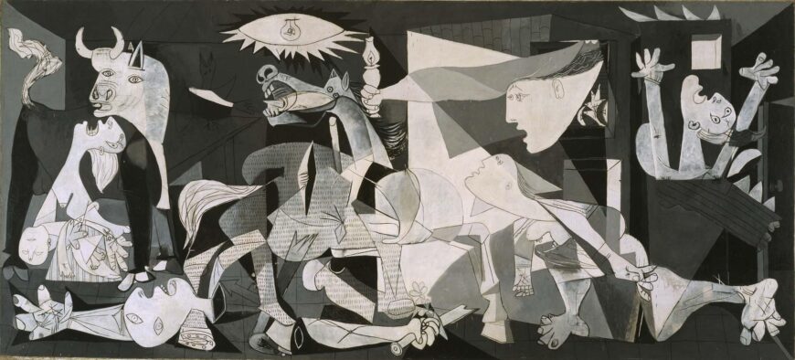
Much of the painting’s emotional power comes from its overwhelming size, approximately eleven feet tall and twenty five feet wide. Guernica is not a painting you observe with spatial detachment; it feels like it wraps around you, immerses you in its larger-than-life figures and action. And although the size and multiple figures reference the long tradition of European history paintings, this painting is different because it challenges rather than accepts the notion of war as heroic. So why did Picasso paint it?
In 1936, Picasso (who was Spanish) was asked by the newly elected Spanish Republican government to paint an artwork for the Spanish Pavilion at the 1937 Paris World’s Fair. The official theme of the Exposition was a celebration of modern technology. Yet Picasso painted an overtly political painting, a subject in which he had shown little interest up to that time. What had happened to inspire it?
In 1936, a civil war began in Spain between the democratic Republican government and fascist forces, led by General Francisco Franco, attempting to overthrow them. Picasso’s painting is based on the events of April 27, 1937, when Hitler’s powerful German air force, acting in support of Franco, bombed the village of Guernica in northern Spain, a city of no strategic military value. It was history’s first aerial saturation bombing of a civilian population. It was a cold-blooded training mission designed to test a new bombing tactic to intimidate and terrorize the resistance. For over three hours, twenty five bombers dropped 100,000 pounds of explosive and incendiary bombs on the village, reducing it to rubble. Twenty more fighter planes strafed and killed defenseless civilians trying to flee. The devastation was appalling: fires burned for three days, and seventy percent of the city was destroyed. A third of the population, 1600 civilians, were wounded or killed.
On May 1, 1937, news of the atrocity reached Paris. Eyewitness reports filled the front pages of local and international newspapers. Picasso, sympathetic to the Republican government of his homeland, was horrified by the reports of devastation and death. Guernica is his visual response, his memorial to the brutal massacre. After hundreds of sketches, the painting was done in less than a month and then delivered to the Fair’s Spanish Pavilion, where it became the central attraction. Accompanying it were documentary films, newsreels and graphic photographs of fascist brutalities in the civil war. Rather than the typical celebration of technology people expected to see at a world’s fair, the entire Spanish Pavilion shocked the world into confronting the suffering of the Spanish people.
Later, in the 1940s, when Paris was occupied by the Germans, a Nazi officer visited Picasso’s studio. “Did you do that?” he is said to have asked Picasso while standing in front of a photograph of the painting. “No,” Picasso replied, “you did.”
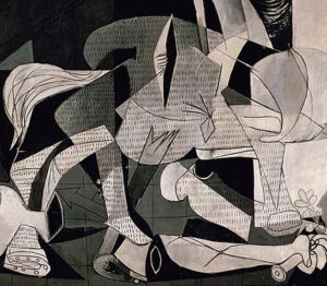
This painting is not easy to decipher. Everywhere there seems to be death and dying. As our eyes adjust to the frenetic action, figures begin to emerge. On the far left is a woman, head back, screaming in pain and grief, holding the lifeless body of her dead child. This is one of the most devastating and unforgettable images in the painting. To her right is the head and partial body of a large white bull, the only unharmed and calm figure amidst the chaos. Beneath her, a dead or wounded man with a severed arm and mutilated hand clutches a broken sword. Only his head and arms are visible; the rest of his body is obscured by the overlapping and scattered parts of other figures. In the center stands a terrified horse, mouth open screaming in pain, its side pierced by a spear. On the right are three more women. One rushes in, looking up at the stark light bulb at the top of the scene. Another leans out of the window of a burning house, her long extended arm holding a lamp, while the third woman appears trapped in the burning building, screaming in fear and horror. All their faces are distorted in agony. Eyes are dislocated, mouths are open, tongues are shaped like daggers.
Picasso chose to paint Guernica in a stark monochromatic palette of gray, black and white. This may reflect his initial encounter with the original newspaper reports and photographs in black and white; or perhaps it suggested to Picasso the objective factuality of an eye witness report. A documentary quality is further emphasized by the textured pattern in the center of the painting that creates the illusion of newsprint. The sharp alternation of black and white contrasts across the painting surface also creates dramatic intensity, a visual kinetic energy of jagged movement.
On first glance, Guernica’s composition appears confusing and chaotic; the viewer is thrown into the midst of intensely violent action. Everything seems to be in flux. The space is compressed and ambiguous with the shifting perspectives and multiple viewpoints characteristic of Picasso’s earlier Cubist style. Images overlap and intersect, obscuring forms and making it hard to distinguish their boundaries. Bodies are distorted and semi-abstracted, the forms discontinuous and fragmentary. Everything seems jumbled together, while sharp angular lines seem to pierce and splinter the dismembered bodies. However, there is in fact an overriding visual order. Picasso balances the composition by organizing the figures into three vertical groupings moving left to right, while the center figures are stabilized within a large triangle of light.
The horse and bull are images Picasso used his entire career, part of the life and death ritual of the Spanish bullfights he first saw as a child. Some scholars interpret the horse and bull as representing the deadly battle between the Republican fighters (horse) and Franco’s fascist army (bull). Picasso said only that the bull represented brutality and darkness, adding “It isn’t up to the painter to define the symbols. Otherwise it would be better if he wrote them out in so many words. The public who look at the picture must interpret the symbols as they understand them.”
In the end, the painting does not appear to have one exclusive meaning. Perhaps it is that very ambiguity, the lack of historical specificity, or the fact that brutal wars continue to be fought, that keeps Guernica as timeless and universally relatable today as it was in 1937.
Copyright: Lynn Robinson, “Pablo Picasso, Guernica,” in Smarthistory, August 9, 2015, accessed June 17, 2024, https://smarthistory.org/picasso-guernica/.
Georges Braque and Pablo Picasso: Two Cubist Musicians
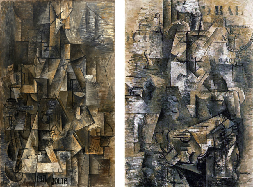
The Portuguese and Ma Jolie are well-known examples of late Analytic Cubism , sometimes called High Analytic Cubism or Hermetic Cubism. The latter name refers directly to the mysterious and difficult qualities of these paintings’ abstraction. The two paintings are very similar in overall appearance. At the time, Braque and Picasso were using the same pictorial language and had stopped signing the front of their paintings, sometimes making it difficult to distinguish authorship of individual works.
Cubist portraits and figure paintings typically follow the traditional format of placing the figure in the center of the canvas. In The Portuguese , darker shadowed planes suggest the upper body in the center. There are also suggestions of cylindrical forms representing the upper arms on the sides of this area, and half circles above them indicate shoulders. On top of the dark torso area rises a long lighter triangle outlining a collection of smaller forms surrounding another dark cylinder. This is the area of the man’s neck and head.
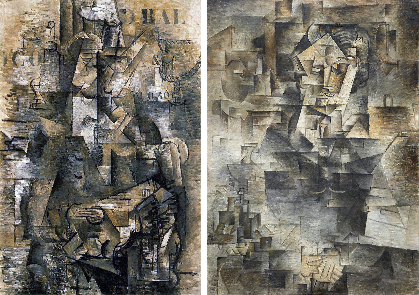
Picasso’s Daniel-Henry Kahnweiler uses a similar yet more legible strategy of contrasting light and dark areas to suggest the head above the body. The face of Braque’s guitar player is more abstracted than Kahnweiler’s face, in which we can find the eyes, nose, and mouth / mustache fairly easily.
In Braque’s painting, curved lines may represent closed eyelids, the bottom of the nose, a mustache, or a chin, but no clear relationships between these marks and those next to them solidly anchor our translation of the schematic lines and angles into a legible face . We cannot identify even the basic features – eyes, nose and mouth – with certainty.
While the guitarist’s face and head in Braque’s painting are a welter of black lines and shifting light and shadowed planes, there are some legible signs within the painting. The one that is most helpful in terms of orienting the viewer is the black outline of the guitar’s sound hole crossed by black horizontal lines indicating the instrument’s strings in the center of the lower portion of the painting. A bright rectangle projects diagonally to the right from the sound hole to indicate the guitar’s fret board.
Once we recognize the location of the guitar we can begin to look for the signs of the figure holding it. This approach to reading Cubist works by looking for identifiable signs and establishing others based on their relationship to them is key to understanding Cubist paintings, particularly the later ones.
They are structured like a language in which basic units (comparable to words) are placed in relation to each other (as words are in a sentence), making it possible to represent and communicate an infinite number of ideas. You could also think of Cubism as an attempt to create a new alphabet or sign language for representation.
One of the most striking aspects of The Portuguese is the inclusion of letters, numbers, and an ampersand in the painting’s shadowy, abstract planes. They are in standardized stencil format and suggest partially visible posters or painted signs, perhaps on the walls or windows of an interior space. They are also flat forms floating in ambiguous relation to the complex spatial planes depicted in the painting; neither clearly foreground nor background, they remind the viewer that the painting is literally a flat surface and even its confusing shallow planar space is an illusion.
The letters, numbers, and ampersand also repeat our experience of trying to understand the painting by the limited number of identifiable visual signs. We recognize them as individual signifying units, but they don’t make up complete words; the information they provide is only partial, and we have to fill in the blanks.
The Portuguese offers an array of clues in the form of letters, symbols, abbreviated representations, suggestive forms, and signs. It is a mystery with many possible readings and no single correct solution. By the time The Portuguese was painted neither Braque nor Picasso worked directly from life. Despite Braque’s letter informing Kahnweiler that the painting’s subject was a Portuguese guitar player he saw on board a ship in Marseilles, it is unlikely that a specific real world scene is the basis for every detail in the painting.
Picasso’s Ma Jolie is even more abstract than Braque’s The Portuguese . Other than a greater concentration of shaded planes in the center of the painting there is little suggestion of a distinction between figure and background, or head and body. Picasso does provide a few visual hints of the subject, signs that he used, often more legibly, in contemporary works.
Curved black lines in the lower corners are often interpreted as indicating the arms of a chair, and the group of short parallel lines ending in circles on the lower right may be tassels or fringe on the chair. Six vertical lines in the center of the painting suggest the strings of a guitar or zither. The words “Ma Jolie” (“my pretty one” in French) accompanied by a musical staff and treble clef painted at the bottom of the canvas refer to a popular song of the day, as well as to Picasso’s nickname for his current girlfriend.
The reference to a popular song adds to the multiple ways music is the subject of Analytic Cubist paintings. In part, musical references are practical; musical instruments are more complex and interesting forms than the glassware and bottles that were also common Cubist subjects. Musical instruments are easy to identify by parts and lend themselves to the formal transformations foundational to Cubist innovations. Braque was an amateur musician, and both artists had various instruments in their studios. Music was also an important touchstone for Cubism more generally. As a non-representational art form with its own internal structures and systems of tones and rhythm, music is an abstract language that is suggestive rather than concretely referential. The paintings of late Analytic Cubism with their mysterious objects and figures in indeterminate space are like music; they are visual orchestrations of painted forms in which shifting patterns suggest far more than they clearly depict. For both Picasso and Braque these paintings were as close as they were willing to approach complete abstraction.
Copyright: Dr. Charles Cramer and Dr. Kim Grant, “Georges Braque and Pablo Picasso: Two Cubist Musicians,” in Smarthistory, March 23, 2020, accessed June 17, 2024, https://smarthistory.org/georges-braque-pablo-picasso-two-cubist-musicians/.
Surrealism
Surrealism: An Introduction
Historians typically introduce Surrealism as an offshoot of Dada. In the early 1920s, writers such as André Breton and Louis Aragon became involved with Parisian Dada. Although they shared the group’s interest in anarchy and revolution, they felt Dada lacked clear direction for political action. So in late 1922, this growing group of radicals left Dada, and began looking to the mind as a source of social liberation. Influenced by French psychology and the work of Sigmund Freud, they experimented with practices that allowed them to explore subconscious thought and identity and bypass restrictions placed on people by social convention. For example, societal norms mandate that suddenly screaming expletives at a group of strangers—unprovoked, is completely unacceptable.
Surrealist practices included “waking dream” seances and automatism. During waking dream seances, group members placed themselves into a trance state and recited visions and poetic passages with an immediacy that denied any fakery. (The Surrealists insisted theirs was a scientific pursuit, and not like similar techniques used by Spiritualists claiming to communicate with the dead.) The waking dream sessions allowed members to say and do things unburdened by societal expectations; however, this practice ended abruptly when one of the “dreamers” attempted to stab another group member with a kitchen knife. Automatic writing allowed highly trained poets to circumvent their own training, and create raw, fresh poetry. They used this technique to compose poems without forethought, and it resulted in beautiful and startling passages the writers would not have consciously conceived.
In the autumn of 1924, Surrealism was announced to the public through the publication of André Breton’s first “Manifesto of Surrealism,” the founding of a journal (La Révolution surréaliste), and the formation of a Bureau of Surrealist Research. The literary focus of the movement soon expanded when Max Ernst and other visual artists joined and began applying Surrealist ideas to their work. These artists drew on many stylistic sources including scientific journals, found objects, mass media, and non-western visual traditions. (Early Surrealist exhibitions tended to pair an artist’s work with non-Western art objects). They also found inspiration in automatism and other activities designed to circumvent conscious intention.
Another technique, the exquisite corpse, developed from a writing game the Surrealists created. First, a piece of paper is folded as many times as there are players. Each player takes one side of the folded sheet and, starting from the top, draws the head of a body, continuing the lines at the bottom of their fold to the other side of the fold, then handing that blank folded side to the next person to continue drawing the figure. Once everyone has drawn her or his “part” of the body, the last person unfolds the sheet to reveal a strange composite creature, made of unrelated forms that are now merged. A Surrealist Frankenstein’s monster, of sorts.
Today, we tend to think of Surrealism primarily as a visual arts movement, but the group’s activity stemmed from much larger aspirations. By teaching how to circumvent restrictions that society imposed, the Surrealists saw themselves as agents of social change. The desire for revolution was such a central tenet that through much of the late 1920s, the Surrealists attempted to ally their cause with the French Communist party, seeking to be the artistic and cultural arm. Unsurprisingly, the incompatibility of the two groups prevented any alliance, but the Surrealists’ effort speaks to their political goals.
In its purest form, Surrealism was a way of life. Members advocated becoming flâneurs–urban explorers who traversed cities without plan or intent, and they sought moments of objective chance—seemingly random encounters actually fraught with import and meaning. They disrupted cultural norms with shocking actions, such as verbally assaulting priests in the street. They sought in their lives what Breton dubbed surreality, where one’s internal reality merged with the external reality we all share. Such experiences, which could be represented by a painting, photograph, or sculpture, are the true core of Surrealism.
Copyright: Josh R. Rose, “Surrealism, an introduction,” in Smarthistory, September 8, 2016, accessed June 18, 2024, https://smarthistory.org/surrealism-intro/.
René Magritte, The Treachery of Images (Ceci n’est pas une pipe)
Video URL: https://youtu.be/w702yvnip_w?si=IisgNuBHoIzsQ9IT
Salvador Dalí, The Persistence of Memory
Video URL: https://youtu.be/6mp-fBJNQmU?si=oPD84fBN0rJByr2G
What is: Degenerate Art?
Video URL: https://youtu.be/-3DjtCQ_26s?si=jDQImywO_epuce7P
Käthe Kollwitz, In Memoriam Karl Liebknecht

Käthe Kollwitz, Memorial Sheet of Karl Liebknecht (Gedenkblatt für Karl Liebknecht), 1919–20, woodcut heightened with white and black ink, 37.1x 51.9 cm (The Museum of Modern Art)
In the political turmoil after the First World War, many artists turned to making prints instead of paintings. The ability to produce multiple copies of the same image made printmaking an ideal medium for spreading political statements. German artist Käthe Kollwitz worked almost exclusively in this medium and became known for her prints that celebrated the plight of the working class.
The artist rarely depicted real people, though she frequently used her talents in support of causes she believed in. This work, In Memoriam Karl Liebknecht was created in 1920 in response to the assassination of Communist leader Karl Liebknecht during an uprising of 1919. This work is unique among her prints, and though it memorializes the man, it does so without advocating for his ideology.
From the end of the First World War in late 1918 to the founding of the Weimar Republic (the representative democracy that was the German government between the two World Wars) in August 1919, Germany went through a period of social and political upheaval. During this time, Germany was led by a coalition of left-wing forces with Marxist sympathies, the largest of which was the Social Democratic Party of Germany (SPD). Other, more radical groups were grappling for control of Germany at the same time, including the newly founded German Communist Party (KPD).
The Socialists and Communists both wanted to eliminate Capitalism and establish communal control over the means of production, but while the Socialists believed that the best way to achieve that goal was to work step by step from within the Capitalist structure, the Communists called for an immediate and total social revolution that would put governmental power in the hands of the workers. In this spirit, the KPD staged an uprising in Berlin in January 1919. Military units called in by the SPD suppressed the uprising and captured two of the leaders, Karl Liebknecht and Rosa Luxemburg. Liebknecht and Luxemburg were murdered while in custody on January 15, 1919. Their deaths struck a chord across the left-wing landscape and they were widely celebrated as martyrs to the Communist cause.
Kollwitz was not a Communist, and even acknowledged that the SPD (generally more cautious and pacifist than the KPD), would have been better leaders. But she had heard Liebknecht speak and admired his charisma, so when the family asked her to create a work to memorialize him she agreed.
The composition divides the sheet into three horizontal sections. The top section is densely packed with figures. Their faces are well modeled and have interesting depth in themselves, but the sense of space is very compressed – the heads push to the foreground and are packed into every available corner of space. It gives the impression of multitudes coming to pay their respects, without compromising the individuality of the subjects.
The middle strata contains comparatively fewer details, further emphasizing the crowding at the top of the printing plate. This section draws attention to the specific action of the bending mourner. His hand on Liebknecht’s chest connects this section to the the bottommost level of the composition, the body of the martyred revolutionary.
Woodblock printing is a technique in which a design is carved into a slab of wood which is then covered with ink and printed onto paper. Ink coats the original surface of the wood block, which prints as black, while the cut away areas stay the color of the paper. This is different from printmaking methods such as engraving in which the ink is caught in the recesses carved into the metal plate by the stylus and therefore the lines print black and the untouched areas of the plate come out white in the print.
The German Expressionist artists, in particular Ernst Ludwig Kirchner and the Brücke group, used woodcuts as early as 1904 to capture the rough, vital energy that they perceived in the work of so-called “primitive” societies without a fine art tradition.
Kollwitz’s career overlapped with the German Expressionists but she was not an Expressionist herself and was about a generation older than most of them. Her use of such a trendy technique was uncharacteristic, and in fact, she only worked in woodblocks for a few years after the First World War. Kollwitz created some of her most powerful and affecting work in this style, including the War print cycle of 1924. She embraced the raw effect of woodblock printing to create pieces works that have cast off the subtlety and finesse of her earlier work in etching and lithography. Kollwitz’ felt that her protest against the horrors of war was best communicated in the rough edges and stark black and white that woodblock prints afforded.
Copyright: Shawn Roggenkamp, “Käthe Kollwitz, In Memoriam Karl Liebknecht,” in Smarthistory, August 9, 2015, accessed June 17, 2024, https://smarthistory.org/kathe-kollwitz-in-memoriam-karl-liebknecht/.
Jibaro, Bomba, and Plena Music of Puerto Rico
There are three primary folk music genres indigenous to the Island of Puerto Rico. These are the Spanish-derived jibaro music associated with the small farms and interior mountain communities, and the bomba and plena styles identified with the coastal towns with larger African populations.
Because Puerto Rico’s agricultural economy was centered in coffee and tobacco and not the labor-intensive sugar industry that dominated most of the Caribbean, fewer African slaves were imported and the influence of Spanish culture remained strong. The jibaros, the Spanish descendents who worked the interior farms, developed their own song and dance forms based heavily on Spanish traditions. Elite dance music and poetry, imported from Europe by the wealthy landowners, or hacendados, along with Spanish folk traditions, found their way into the jibaros repertoires. The seis is song set in 10-line verse form with lyrics dealing with idealized love, motherhood, the suffering of the jibaro farmer, and the beauty of the Puerto Rican countryside. Another song form, the aguinaldo, is associated specifically with the Christmas season. The seis and aguiandlo may be sung in a slow, ballad style, or played in a livelier
In coastal towns like Ponce, where African slaves were brought to work the sugar plantations, bomba and plena music developed. Bomba, the most African-influenced Puerto Rican folk style, features exuberant call-and-response singing between a leader and a chorus, interlocking drum patterns, and intense drummer/dance interaction (the latter responds to the lead drummer’s improvised rhythms). A typical bomba ensemble consists of a pair of sticks known as fúa or cua that provide a steady ground beat when struck on a hard surface; a maraca; and two or more barrel-shaped drums. The lyrics to bomba songs usually refer to everyday work and social events.
Plena is a creolized folk song that combines African-derived call (leader) and response (chorus) singing, drumming, and dance with European-derived melodies and harmonies. A traditional plena ensemble includes several handheld frame drums called panderetas (similar to a tambourine but without the metal jingles), the güiro (scraped gourd), and one or more melodic instruments such as the accordion, harmonica, or cuatro. Often referred to as “el periodico cantado” (the sung newspaper), plena songs relate current and historical events of community life. In recent years the plena ensembles have incorporated horns, keyboards, electric bass, and extended percussion to produce a more modern dance sound.
Source: D. Cohen, Music – Its Language, History and Culture is shared under a CC BY 4.0 license and was authored, remixed, and/or curated by Douglas Cohen (Brooklyn College Library and Academic IT) via source content that was edited to the style and standards of the LibreTexts platform. Davis, CA: LibreTexts
Carnival Music from Trinidad and Brooklyn
Trinidad, the small Caribbean island nation located just off the coast of Venezuela, is home to one of the world’s largest carnivals. New World urban carnivals have their immediate roots in the pre-Lenten celebrations of medieval and Renaissance Europe. On such occasions large numbers of the people took to the streets to frolic and engage in satirical performances that often challenged social hierarchy and everyday order. When Euro-Catholic carnival practices were transplanted to the New World by French, Spanish, and Portuguese settlers, they mixed and mingled with the traditions of the African slaves and their descendants, resulting in the emergence of spectacular creolized celebrations in cities such as Rio de Janeiro, Brazil; Port of Spain, Trinidad; and New Orleans. Increasingly these festivities took on an African flavor, as African masking traditions and neo-African music styles featuring call-and-response singing, improvisation, and syncopated dance rhythms became hallmarks of urban carnival.
The development of carnival in Port of Spain, Trinidad, demonstrates this process. The original 18th-century pre-Lenten street processions of the French planters were eventually taken over by the island’s African population who blended their own emancipation celebrations into the European festivities. By the mid-19th century they had established a large-scale annual celebration in the days leading up to Ash Wednesday. Street rituals evolved around groups of masqueraders who paraded and danced to percussion ensembles and a chantwell who led the revelers in rowdy call-and-response singing that became an important source of modern-day calypso song. By the early post–World War II years ensembles of steel pan players (steelbands) became the main source of music for the street processions of carnival masqueraders (mas bands).
By the turn of the 20th century the noisy call-and-response street carnival singing developed into calypso songs characterized by lyrical melodies, bouncy syncopated rhythms, and a solo verse/chorus refrain structure. Drums and bamboo percussion instruments were replaced by string (usually guitar) and horn accompaniments. Calypso songs offered witty and satirical commentary on a wide range of social issues, current events, and lewd scandals, often mocking the pretensions of the upper classes. In the 1930s a number of calysponians boasting titles like Lord Invader, the Duke of Iron, Houdini, and Roaring Lion traveled to New York to record and perform. Eventually they would foment a calypso craze in the United States that culminated with Harry Belafonte’s 1957 hit, “Day-O.” By the late 1970s Trinidadian calypso singers were incorporating elements of American disco and soul music into their sound to forge the new style of soca (soul/calypso), which featured a pounding bass line, heavy drums, and riffing synthesizers. Soca lyrics, often based around simple choruses exhorting listeners to party and dance, generally lacked the sophisticated wit and sardonic commentary associated with earlier calypso songs.
The second important Trinidadian carnival tradition, steel pan music, grew out of 19th and early 20th century drum and bamboo percussion ensembles that accompanied singers and costumed revelers in carnival street processions. Sometime in the mid-1930s tamboo bamboo percussion ensembles began experimenting with paint and trash cans, automobile brake drums, and other metal objects. Players eventually discovered that different pitches could be achieved by pounding the bottoms of metal containers into different shapes and striking them with sticks. Following WW II, the first true steel drums were forged by pan tuners (builders) who cut oil drums into different sizes to produce a wider tonal range. More sophisticated techniques were developed for grooving notes, leading to pans capable of producing fully chromatic scales and conventional Western harmonies. By the 1950s steel pan orchestras were playing complex arrangements of calypsos as well as Latin dance music, American pop songs, and European classical pieces.
Steel orchestras grew in size, and today may number as many as 100 performers playing a range of pans divided into six or seven sections. The high-range tenor pans usually play the primary melodic line while the double tenors and double seconds double the melody or contribute second melodies. The mid-range cello and guitar pans provide chordal accompaniment. Full-sized, fifty-five gallon drums, arranged in six, nine, or twelve drum configurations, maintain a moving bass line. A trap drum set, one or more conga drums, an iron (automobile brake drum struck with a metallic stick), and additional hand percussion provide a dense rhythmic accompaniment for dancing.
Brooklyn’s West Indian Carnival, based on the Trinidad model, is the most recent urban carnival to rise to prominence. Originally staged in Harlem on Labor Day (in deference to NYC’s climate that would not allow for a large-scale outdoor festivities during the traditional mid-winter, pre-Lenten carnival season), West Indian Carnival moved to central Brooklyn’s Eastern Parkway in the late 1960s where large numbers of West Indians were settling following the 1965 immigration reforms. Mas bands of fancy costumed carnival-goers dance to steel bands and sound trucks pumping out contemporary calypso and soca hits as well Jamaican reggae, Haitian konpa, and the latest pop music offerings from Grenada, Barbados, and Panama. By the 1990s Brooklyn Carnival had evolved into the largest ethnic festival in the United States, drawing an estimated two million people. The festivities stretch over the entire Labor Day weekend with a series of nightly concerts headlined by international calypso and reggae stars, fancy costume competitions, and a panorama contest featuring the borough’s top steel bands.
Source: D. Cohen, Music – Its Language, History and Culture is shared under a CC BY 4.0 license and was authored, remixed, and/or curated by Douglas Cohen (Brooklyn College Library and Academic IT) via source content that was edited to the style and standards of the LibreTexts platform. Davis, CA: LibreTexts
